The Chanterelle Colorscheme
For the last year or so, I have been reading a little bit about the theory behind colorschemes in my spare time. This is something I have been meaning to get into for a while; visualizations are an important part of technical communication, and a nice colorscheme can make or break the visualization. Using Viridis is all well and good, but I like to put a personal touch on my documents, so I wanted to make my own.
By now, most people who work with data know that a good colorscheme is supposed to be “perceptually uniform”. They can hand-wave an argument about how the default colormaps in Matlab misrepresent your data.
I was totally on board with the
premise, but it was not clear to me exactly how we determine
perceived differences in color to assess that a colorscheme is uniform.
I wanted to learn how to do the analysis that led to the creation of colormaps like
Viridis and
the cmocean colormaps.
The Result
The theme is inspired by the Norwegian forest, and ranges from a dark pine green, to a mossy lush green, to a pale chanterelle yellow.
The theme also has a bright variant, with a compressed range of lightnesses suitable for categorical data or decoration. This is the gradient that decorates the website!
Color Spaces & “Perceptual uniformity”
Colors in computer programs are represented by coordinates in a color space.
The most well known color space is RGB.
Most programmers will also be familiar with HSL.
The Euclidian distance between two colors in RGB and HSL is not the same as the perceived difference in color. Phrased differently: A change in coordinates does not correspond linearly to a change in perceived color.
To illustrate, consider a gradient with a linear change in hue
from
to calculated in HSL:
The gradient has obvious perceptual bright spots. (Look at the yellow band)
To deal with this, people have developed color spaces where the Euclidian distance between colors does correspond to a much more consistent change in perceived color.
It turns out, this is fairly complicated, because human brains are weird.
To demonstrate the effect, compare the above gradient to the same gradient, calculated in a perceptually uniform color space, okLCh:
A myriad of such color spaces exist, and they have a long history of development. They mainly differ in how much detail about human visual processing they account for, with the state of the art gradually incorporating more information into its model of human perception.
At this point, the answer to the question has one possible fairly trivial answer: If you just pick uniformly spaced points in a perceptually uniform color space, you will get a gradient which is perceptually uniform.
A gradient from to gets us a pretty nice faux Viridis:
Color Difference
If a color space was truly perceptually uniform, the Euclidian distance between colors would correspond to the perceived color difference. Since color spaces are perceptually uniform to varying extents, we need a way to measure the difference between colors. Like color spaces, a variety of metrics for calculating the perceived difference between colors exist.
CIEDE2000
is the state of the art.
It is usually denoted $\Delta E^*$.
The formula is complicated, but not that important:
Colors.jl
has a function for computing color differences,
and it uses CIEDE2000 by default:
colordiff(, ) = 8.3
colordiff(, ) = 30.7
colordiff(, ) = 100.6
colordiff(, ) = 12.9
This allows us to quantify how a colorscheme changes.


As you can see, even Viridis is not completely uniform as far as CIEDE2000 is concerned.
An example of a bad colorscheme, is Jet — the colorscheme everyone loves to hate:

Yikes!
Everything that needs to be said about Jet has already been said by others. The main take-away from comparing Viridis to Jet is that we don’t need to strive for absolute uniformity to make a usable colorscheme, and in fact “absolute uniformity” is meaningless; a colorscheme is only ever uniform with respect to some measure of color difference.
You could shift the goalpost indefinitely, but as long as the rate of change of perceived color is reasonably flat according to one of the typical metrics, the colorscheme will be usable.
So how did we do?


It’s fine, of course :-)
Can we do better?
Picking a linear gradient through a perceptually uniform color space is one way to make a perceptually uniform colorscheme. You might think that restricting yourself to a linear change in lightness, hue and chroma is needlessly restrictive, and you would be right!
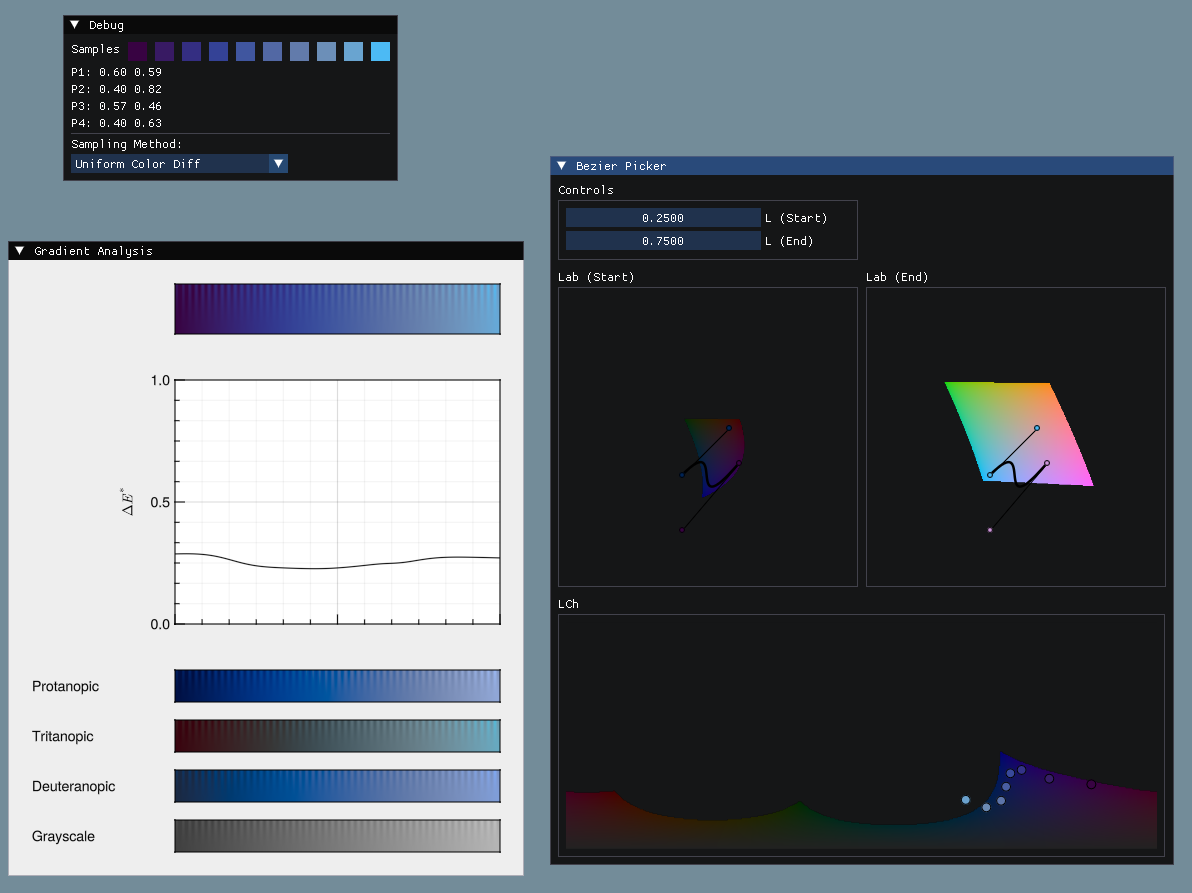
Creating a tool
While working through the literature, I found myself wanting a tool for defining color schemes based on splines. The idea is simple: We define a range of lightnesses, and that leaves us with two dimensions – hue and chroma – in which the desired gradient can be defined with a spline.
Taking the color difference as a derivative, we can define the arc length in terms of color difference, and sample the spline uniformly in terms of color difference.
Very flexible and perfectly uniform; it sounds brilliant!
So I created one.
What I found was that this workflow is quite cumbersome.
UX Problems
The biggest UX problem is that you are defining your spline in hue/chroma-space, but the color gamut depends on brightness, and the brightness changes along your spline, which makes it very easy to accidentally create color schemes that go out of gamut and introduce banding. I work around it by showing the spline in the gamut on the end points of the lightness range, and can sort of mentally interpolate between them, but it is not very user friendly; you usually have to draw the spline at least partially outside the gamut at the endpoints.
Another issue is that it is actually quite easy to make gradients with unfortunate inversions in hue or chroma if you make splines with kinks, and while still uniform in the sense that the color changes very smoothly locally, such color schemes definitely introduce artifacts if used for plotting data.
All in all: I generally think that linear gradients, or splines with very minimal curvature, look the best.
So can we do better? I’m not so sure.
Takeaway
I ended up opting for a linear gradient anyways, and despite being happy with the colorscheme, this post has been in limbo for a year because I wasn’t happy with the tool :v)
The tool, as well as the Julia packages for working with splines and analyzing color schemes, is available on Codeberg. It is a little rough around the edges to put it mildly; more or less half-finished since I didn’t find it very useful as a tool, but it was still a fun project to work on.
Maybe I’ll have some bright ideas for how to visualize the space for drawing the splines in the future :-)